
Maintain a portfolio of treasures
As a historic brand, Kellogg’s has been able to remain popular both on shelves and in homes through the creation of powerful subsidiary brands with well-defined territories. Since 2007, the brand has entrusted Blackandgold with reinforcing, repositioning, and reactivating its highly-valued franchises in European and Chinese markets.
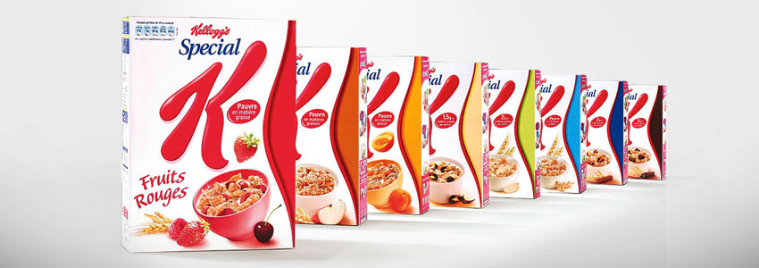
SPECIAL K
Empower Wellness
The Challenge
After a period of diversification with constantly renewed varieties, the Special K range had gained exposure, but lost its clarity and impact.
Our Brand Idea
Help the brand to reassert its leading position and re-emerge on the shelves by building on historical assets. Iconic, feminine, and irresistible, the new Special K packaging projects a strong message on shelves, embodying a new sense of "guilt-free indulgence”. More white creates more focus on the “figure” message, with a central shape replaced by the visual evocation of a hip, drawing on lively colours to create a feeling of rhythm and movement in the range.
The Result
A consolidated Special K range, which has confirmed its place as #1 in healthy breakfast cereals.
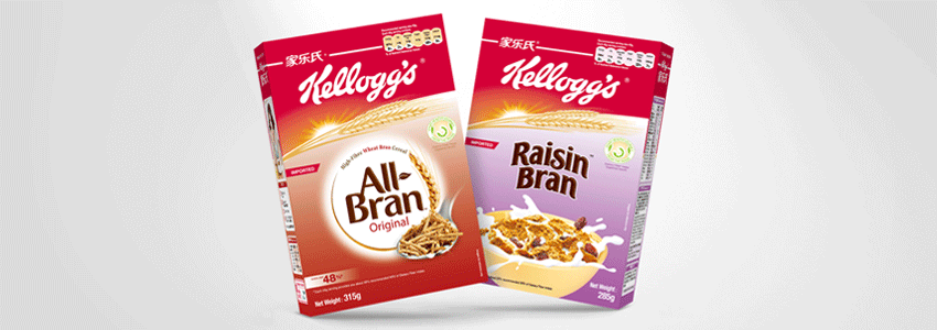
ALL-BRAN
Manage credibility and relevance
The Challenge
All international brands entering China face the same issue: How can they be locally relevant without losing their international edge? How can they build awareness in a country where most people do not speak English? In other words, how far should the adaptation go?
Our Brand Idea
A double facing was chosen for All-Bran, one in English, one in Mandarin, to clearly reinforce the quality of this imported product. The construction of each facing was identical: 1/3 dedicated to the Kellogg’s branding (accompanied by its Chinese name), 2/3 dedicated to All-Bran branding, including a minimalist focus on the two key benefits. The clear reading of the information contributed to enhancing the quality and credibility of this imported product.
The Result
The unique packaging solution helped to convince more sales partners that the brand had potential. As a consequence, it was able to penetrate more channels while increasing sales.
EXTRA
Focus on Extra indulgence
The Challenge
With a recipe enhanced by chocolate chips, Extra aimed to achieve the position of the most indulgent adult cereal. In order to attain this stature, they needed to re-evaluate their visual cues.
Our Brand Idea
Change the Extra brand message from abundance to selectivity. In order to accentuate the irresistibility of the product, we chose to drop the long-standing and key cornucopia visual, in favour of a serving scoop. This instrument is used only for the finest ingredients, and presents the crunchy, golden flakes in the center of the packaging, emphasising the product’s sensory appeal. Strong chiaroscuro contrasts create a feeling of mystery and warmth, much like the visual ‘cues’ of quality used in coffee and chocolate marketing. Gold lettering adds the final touch to the brand’s transformation.
The Result
An upgrade to the range well-received by the market, and a reinforcement of the target group of professional men.

CORN FLAKES
Awaken a breakfast icon
The Challenge
Surrounded by private label competition in the most basic, undifferentiated segment of the cereal market, Kellogg’s Corn Flakes needed to set itself apart in order to avoid being relegated to the brand graveyard.
Our Brand Idea
Rather than lapsing into the ever-escalating game of on-pack claims and self-justifications, we chose to simplify the message by promoting the long history of Corn Flakes, an established pioneer in its segment. This led to the kind of visual strategy used only for the biggest brands: a stripped-down approach. We chose to return "Cornelius the Cockerel" to the forefront, drawing on his historic appeal. Set against a white background, with a sober typography and a smaller product visual, this powerful icon helped Corn Flakes reclaim its rightful place as a breakfast classic.
The Result
Re-emerging on shelves with a sleek new look, Kellogg’s Corn Flakes was able to stabilise its sales, and even to justify new advertising promotions.